
3 Design Heuristics that the new Android 12 UI violates
Published:
Prior to my phone forcing the new Android 12 update on me, I had read some of the reviews and, suffice it to say, I was not excited about it at all. Now that I’ve used it for a week, I will attempt to explain some of its design shortcomings through a designer’s lens. I decided to write this now and not immediately after the update, because I wanted to fully explore the new features and also maybe detach myself from immediate feelings of anger about some features.
As a student in Human-Centered Design and Engineering, the principles and guidelines of good user-centered design are important lenses through which I view any designed artifact. In this article, I will highlight 3 ways in which the new Android 12 UI is not well designed. I will be using, for my analysis, 3 of Nielsen’s Heuristics, a list of 10 broad rules-of-thumb for good design.
First, a note on my positionality. I consider myself a veteran Android user, having used Android devices for the past 7 years. I use a Google Pixel 5a, a family of devices towards which the new update seems to be focused towards.
1. Visibility of system status: This heuristic dictates that an interface should always keep the user informed of its status, or allow the user to infer the state through quick and appropriate feedback.
Android 12’s status bar is an example of this heuristic being violated when there are notifications. In previous versions, swiping down the notification would either enlarge the notification and condense the icons, or vice versa i.e. display the text on the icons and condense notifications. However, a long swipe on Android 12 (Figure 1) pushes notifications off the screen and fills it with the enlarged status bar, making it so that the user can easily miss notifications or simply not be aware of them. It is impossible to tell from the image below but at the time of this screenshot, I have 12 unread notifications.

2. Consistency and Standards: A system that is consistent and follows standards will follow product and industry conventions, allowing users to easily figure out which words/actions mean the same things.
A major change from previously consistent standards in this UI is the process of switching from Wifi to Mobile Data, something I do several times a day in transit. The previous versions had two clear, distinguishable buttons on the notification dropdown that could be turned on/off with one click (Figure 2). In the new version (Figure 3), it is not clear on how to achieve that task. It took me a while to figure out that the UI now condenses those two tasks under the umbrella ‘Internet’ button, and clicking it takes me to a sub-menu where I can turn off Wifi and turn on Mobile Data, thus increasing the number of clicks while making the operation less discoverable than before.

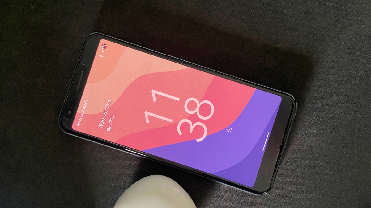
3. Aesthetic and minimalist design: Interfaces should be minimalist in their design so as to not overwhelm the user, while also being aesthetically pleasing.
Okay, maybe this one is a stretch, but I really dislike the giant clock that Android 12 forces users to have on the lockscreen (Figure 4). It takes up a LOT of screen space and is a marked difference from previously minimalist lock screen designs. While I understand that a large clock may be desirable and much more accessible to some users, what I dislike the most about this design is the fact that the size of the clock cannot be customized. This has forced unhappy Android 12 users to get creative, leading to emergent design ideas of keeping unread notifications on the lockscreen to reduce the size of the clock.
I write this article in the hope of contributing to the user community’s displeasure about some or all of these features, and the dream of Android developers recognizing avenues for improvements that their users desire.